Perfecting Patient Payment


Problem

Medical coding and billing seems impenetrable.Sometimes it looks as if chimpanzees are typing in random strings of numbers. The bills and explanations arrive months if not years after the event. The numbers are unfamiliar. Memories fog, and calls to hospitals, doctors and insurers to find an explanation are a maze of voicemail prompts, long hold times and little satisfaction. As a result, patients don't pay and it hurts providers and practice. With the increase in high-deductible healthcare plans, patient payments can represent 30% or more of practice revenue. Patient experience can now make or break the practice.

Problem Framing

Solution

We launched a completely overhauled patient payment platform that provides plain language billing code descriptions and visit-level statements with explanation of coverage. It also enables users to quickly and easily resolve common billing issues.

My Role

Design Lead, UX Research

Timeline

Nov. 2019 - Mar. 2020

Tools

Figma, Sketch, Principle, Omnigraffle


New Design


Easy-to-understand billing statements
Empower patients with consolidated easy-to-understand billing statements
Archtypes


Archtypes
Know exactly what you owe
Improve transparency

Bring more users to the checkout page by providing a billing experience built for consumers. The patient-centered interface is designed with usability and accessibility top of mind, leading to better engagement and more payments.

My Contribution

As the only designer at Wellpay, I was the lead UI/UX designer on the provider dashboard and patient payment platform. I led all the research & design activities with PM and engineers, created wireframes, illustrations, high-fidelity designs, and interactive prototypes for user feedback & testing. I worked closely with our CEO, CTO and VP front end engineer to continually review and develope these products. For marketing, I created the promotional video showcasing product features for our social media campaign.

Research


Interviews

We conducted a series of in-depth interviews with patients of different profiles to get a deeper understanding of why, when and how they interact with their medical bills. We talked with young parents on ACA plans, single twenty-somethings with big dreams but no insurance coverage, underinsured creatives who live with their parents, immigrants with Medicaid and chronic conditions, well-paid managers with the best insurance and even an attorney who lives alone with his three birds in Palo Alto. We want to make sure our product is accessible to all kinds of patients, so we needed the perspectives of a diverse group of people.

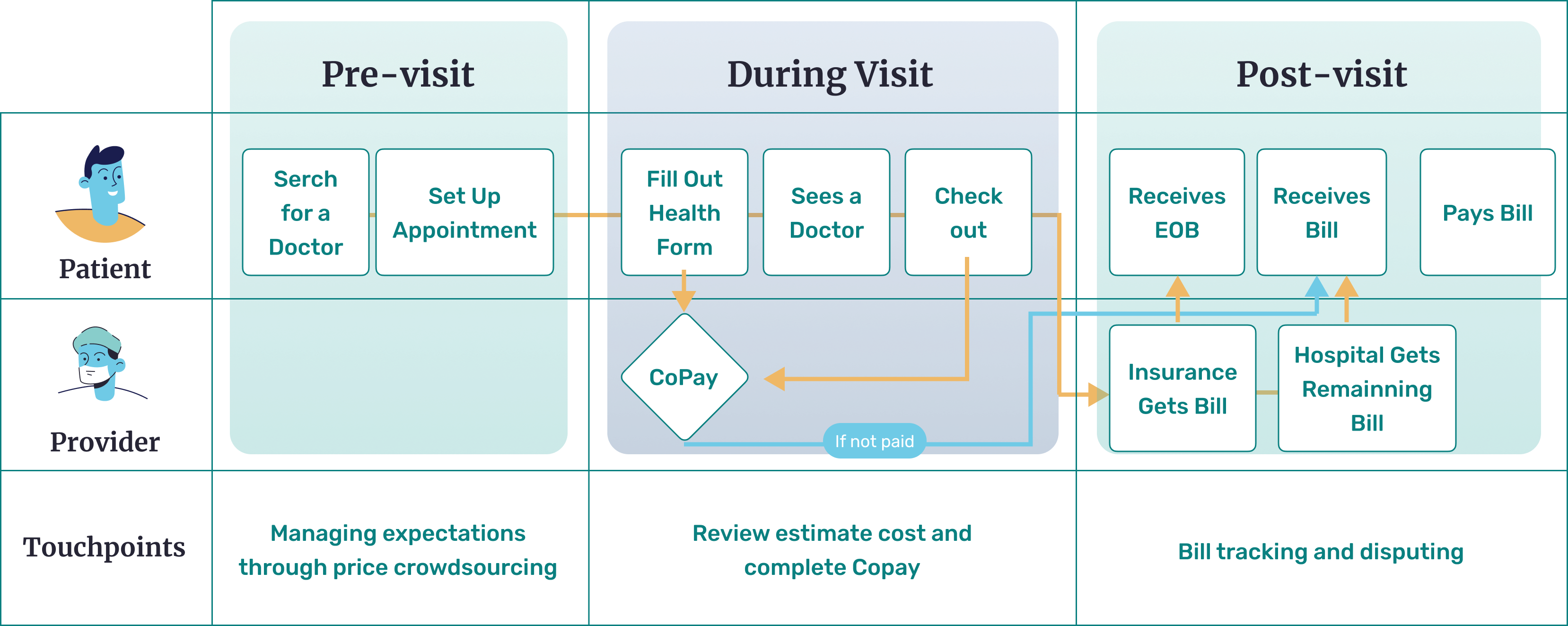
In our research, we identified that patients have difficulty understanding the insurance and payment side of the healthcare system. Despite being on an healthcare insurance, they do not understand the medical process of referrals, insurance terminology and how to financially prepare for medical emergencies.

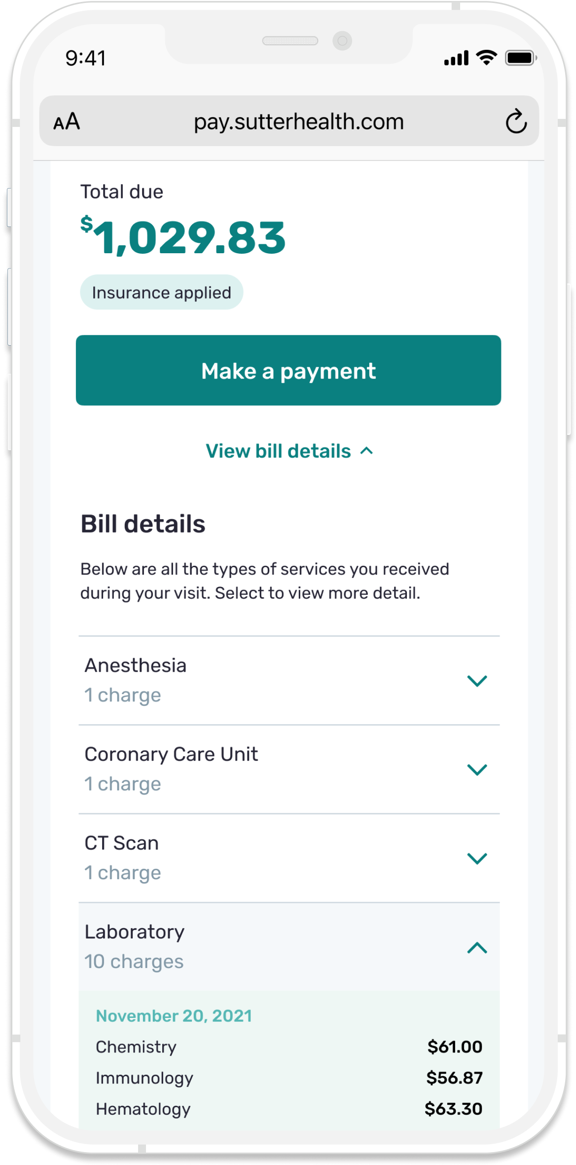
Core Issues No.1 - Confusing insurance terminology and duplicate documents

The terminology used in healthcare statements were confusing. Plus, duplicate statements (e.g. EOB) makes the billing process more confusing. What is a TPA and HSA? And how does it affect co-pay? So, how might we make medical bills feel as thoughtful and empathetic as patient care? To do this, we needed to know:

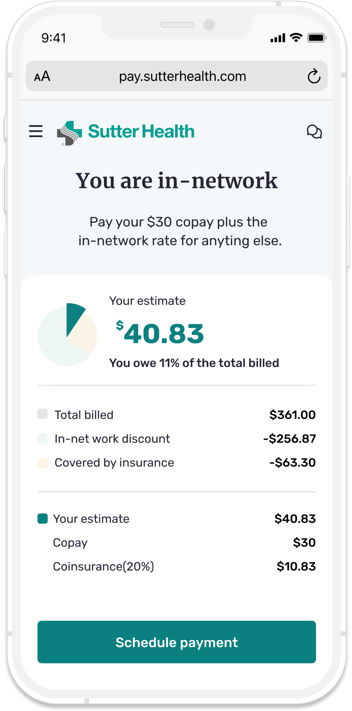
  • How much should patients pay?
  • When do patients pay?
  • Who do patients pay and owe?
  • How does the patient know whether the medical institutions or practitioners are in-network or out-of-network? How can we make payment of services more transparent?

Core Issues No.2 - Lack of transparency because of private negotiated prices

Design

Design Strategy

With the information that we had gathered, we put together a user journey map to highlight 3 touchpoints that could improve patient payment.


Archtypes


Touchpoint 1 - Manage price expectation

Purpose
  • The users can compare prices that are crowdsourced.
  • They can also see what procedures are covered by the insurance company.
  • Since prices are not an indication of quality, we also show out-of-network prices for patients to budget for.
What the user can do
  • When doing a search of medical care, they see price breakdowns of each procedure.


Touchpoint 2 - Review estimate cost and complete Copay

Purpose
  • Provide clear explaination of bill breakdown.
  • Allow patients to pay Copay early.
What the user can do
  • The patient can opt into providing information.
  • The patient would be provided with clear terms and conditions.
  • The information would be broken down in straightforward and understandable terms.


Touchpoint 3 - Bill tracking and disputing

Purpose
  • Both parties are allowed to track what is happening to the payment.
  • The patient is also notified when the insurance claims are being processed.
What the user can do
  • The information in the dashboard can be sorted by date, status, type of care or category.
  • Patients can dispute bill through Wellpay without long-waiting call.