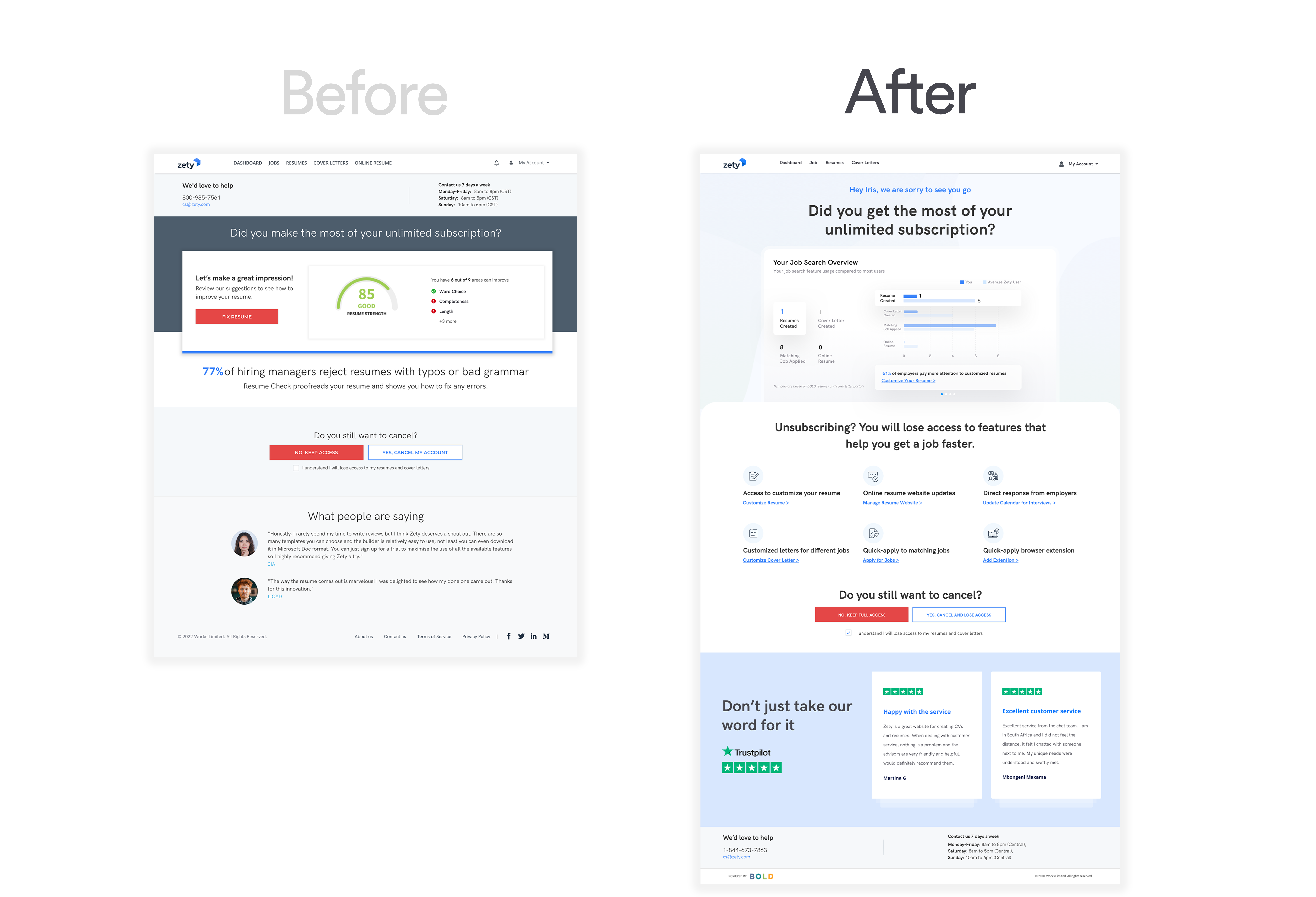
Cancellation flow - How to balance usability and business


Challenge & Requirements

Optimize the current cancellation flow by making the process friendlier for the user, while practice client retention - which is very common in subscription service. The need for creating a "barrier" throught the cancellation process.

Goals

Create a cancellation experience that is less exhausting to users, and it can also positively transform their opinion on the brand and product. My approach is to make users realize how much they have used Zety subscription features against an average user when they try to cancel their subscription.

My Role

UX Research, Web Design

Timeline

2 weeks

Tools

Sketch


beforafter
Pre-cancellation page - engagement metrix
Provide data of user's feature usage such as the number of resume created, cover letter created and matching job applied. Showing these numbers next to an average usage number

Offer patients modern ways to pay their bills. Digital payment options help providers capture more revenue, and auto posting and reconciliation reduces time to cash and streamlines staff workflows.

Problem Validation


Revisit the current Pre-cancellation page

Base on the requirements of this project, we are not making changes on the blue highligh sections(CX info & CTA). In order to improve user retention, we are optimizing the rest of the page. Here are some UX problems I found from the existing page.

  • Lack of hierarchy - Two primary CTAs
  • UI Disconnected - Message and value props disconnected
  • Testimonials not authentic - Profile photos don't feel professional
Foundation